Most product managers are obsessed with the "First Mile." They spend months polishing the signup flow, tweaking the hero copy, and running A/B tests on the welcome email. But here is the hard truth: if your user doesn't know what to do the moment they finish their first session, your retention will flatline by day seven.
Retention isn't an accident. It’s an engineered cycle. If your app feels like a dead end rather than a continuous journey, you aren't missing "engagement"—you're missing a retention loop design.
I’ve spent a decade helping B2B SaaS and mobile teams stop the bleeding. The question I ask in every single audit is simple, yet most teams can't answer it: "What does the user do next?"
The Anatomy of a Continuous Interaction Loop
A continuous interaction loop is a circular feedback system where each action creates value that compels the user to take another action. If the user completes a task in your app and then has to "think" about what to do next, you have introduced friction. In a world of infinite distraction, friction is the silent killer of growth.
Think about your favorite streaming platform. Do you ever have to ask what to do when an episode ends? Of course not. The countdown starts, the next episode cues up, and the narrative bridge keeps you tethered. That is the gold standard of repeat usage.
The Four Pillars of the Loop
The Hook (Trigger): External or internal prompt to start. The Action: The smallest possible step to derive value. The Variable Reward: Not just a dopamine hit, but the gratification of progress. The Investment: Storing value in the app (data, social capital, configuration) to make the next visit better.Why "Tiny Frictions" Are Sabotaging Your Mobile Strategy
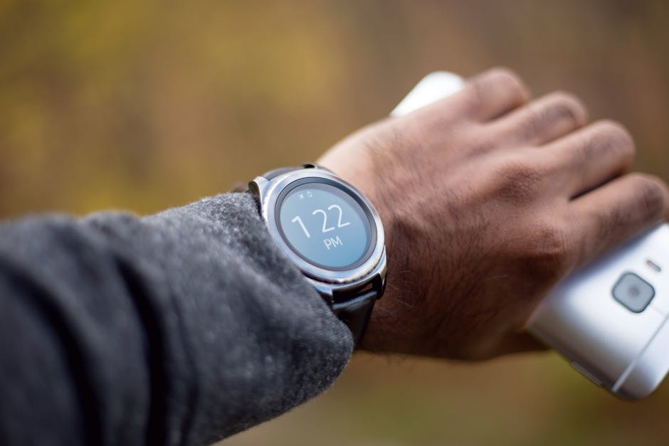
Mobile performance is not a "nice to have"—it is the bedrock of your UX. If your app takes three seconds to load a dashboard, your user has already checked their email. My running list of "tiny frictions" includes things most teams ignore:

- Requiring a second login when the user opens the app after 30 minutes. Complex navigation bars that require more than one thumb movement to reach core features. Forcing users to "save" changes that should auto-save. Unnecessary pop-ups before the user has seen any value.
When McKinsey Digital talks about digital transformation, they aren't just talking about cloud migration. They are talking about the speed of decision-making. If your app forces the user to wait, you aren't helping them make a decision—you're making them abandon the task.
Gamification Beyond the "Badge"
When we talk about progression systems, most B2B teams cringe, thinking of mindless achievement badges. That’s not what I’m talking about. Look at the MrQ casino app. They understand that the "game" isn't just the spin—it’s the clarity of the progress bar, the immediacy of the feedback, and the feeling of momentum.
In a non-gaming B2B app, gamification should be about meaningful progression. If you are building a productivity tool, don't give them a gold star for logging in. Instead, use progression to show them how much time they saved this week compared to last week. That is a loop tied to utility.
Strategy Gamification Hook Value Driver B2B SaaS Milestone Tracking Efficiency/Time Saved Mobile Utility Streak Counters Consistent Workflow Streaming Platform "Watch Next" Queue Continuous Entertainment
Personalization as a Retention Engine
If every user sees the same dashboard, you are failing them. Personalization is no longer a luxury; it’s the expectation. Your recommendation engine needs to do the heavy lifting of surfacing the "next best action."
Look at how B2B News Network (B2BNN) curates content. They aren't just dumping a list of articles; they are contextualizing information to the user's intent. Your app should do the same. If a user spends 80% of their time in your reporting module, your home screen should not be a general activity feed. It should be a shortcut to their top three reports.
When you personalize, you reduce the "cognitive load" required to get back into digital wallet integration the flow. Low-friction navigation means the user doesn't have to navigate; they just have to look at what you’ve already prepared for them.
Mapping the "What Does the User Do Next?" Matrix
To build your loop, you need to map out the user journey as a sequence of prompts. Use this table to audit your current flow.
Step The Action The "What Next?" Prompt Onboarding Set up profile "Invite one teammate to see your progress." Core Task Run a report "Save this report as a weekly alert?" Returning View dashboard "You have 3 new notifications in your saved report."The "Repeat Usage" Checklist
If you want to move the needle on retention, stop looking for "growth hacks" and start looking at your mechanical flows. Here is your actionable checklist:
1. Audit your "Exit Points"
Every screen should lead somewhere. If a screen ends with a "Done" button that takes them to a blank menu, you’ve broken the loop. Replace "Done" with a contextual "Next" step.
2. Kill the "Empty State"
Nothing kills retention faster than an empty dashboard. If there is no data to show, show them a video tutorial, a template to get started, or a "How to run your first report" call-to-action. Never let the screen be empty.
3. Speed is a Retention Feature
If you aren't optimizing your mobile app’s load times, you are effectively paying money to lose customers. A one-second delay in page load time can lead to a 7% reduction in conversions. Fix your technical debt before you spend another dollar on acquisition.
4. Build for the "Internal Trigger"
The strongest retention loops are self-sustaining. Eventually, you want the user to open your app because they feel the itch of a problem you solve, not because you sent them a push notification. That happens when the progression system becomes part of their professional identity.
Final Thoughts: Don't Over-Engineer the Loop
It’s tempting to add layers of complexity—more features, more pop-ups, more "nudge" emails. Don't. The best retention loops are invisible. They feel like a natural extension of the user's workflow.
If you can answer "What does the user do next?" for every single screen in your app, you’ve already beaten 90% of your competitors. Stop focusing on "improving engagement" as a vague metric. Focus on the mechanics of the next action. That is how you build a product that people actually use.